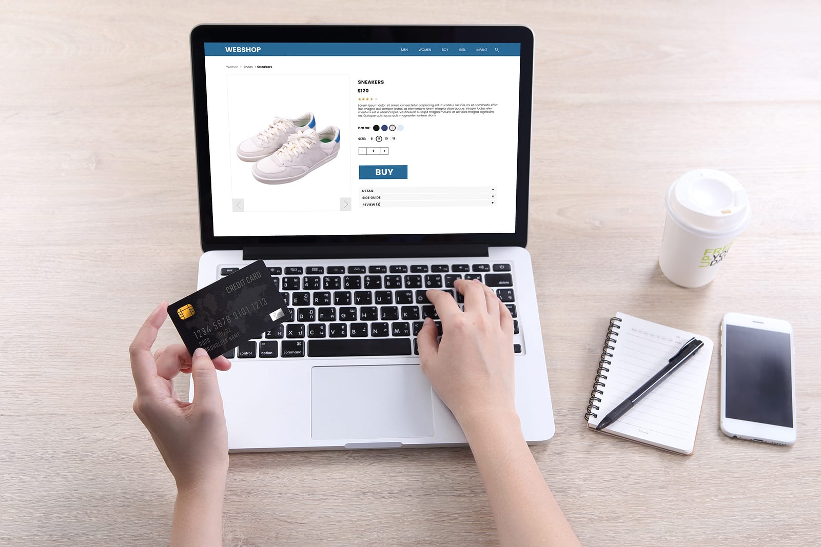
When it comes to ecommerce the market is incredibly crowded. You’re not only competing with other businesses in your town or city, or within the UK. Consumers can order from anywhere in the world, so it pays to take the time to make your shopping experience the best there is.
One area where ecommerce sites can struggle is on the checkout page. It’s easy to think that by the time a customer gets to this point they’re committed to a purchase, but there is the potential for significant drop off and lost orders if this element of your site isn’t well designed.
As a recent article for Business2community explained, if you make the checkout too difficult, customers will give up and look elsewhere for the product they want.
Whether you love or hate Amazon, their checkout process is an example of great design. It makes it incredibly simple for users to buy goods and that means people keep coming back.
If you’re struggling to get people to close their purchase once they’ve put items in their virtual basket, it’s more than likely that your checkout page (or pages) rather than the products themselves are the problem.
And this is where UX design comes in. UX is short for user experience and a designer in this specialism will focus on exactly that – how does your checkout work for your customers.
According to the news provider, one of the biggest stumbling blocks can be overly complex forms. Optimising this part of your checkout process can go a long way towards making the experience more fluid for your users.
Make sure that any forms on your site are mobile optimised, otherwise you’re likely to use people who are on smaller devices. You should also think about how you can make your form easily scannable – that means using vertical alignment for the fields wherever possible.
Similarly, make sure that any drop down options scroll vertically to ensure they are compatible with screens of all sizes.
The website also stressed the importance of offering multiple payment options. Make sure people can pay via PayPal as well as using the major credit or debit cards.
If you’re losing people at the checkout stage of your sales funnel and aren’t sure why, get some help with UX design in London. Experienced designers will be able to analyse and test your pages to see which point is creating friction for users and to then redesign it to remove that hurdle.
An article for The Drum recently explained why you need to start UX testing to improve the experience people have when using your site.
UX designers aren’t mind readers so they need to find out how consumers feel about different elements of a design and that’s where testing comes in. They want to see exactly what issues real users have with a particular page or stage of the journey, and then fix the problems.
Testing provides a valuable perspective without bias, and when you do it regularly you can make tangible improvements to many areas of your ecommerce site. This has the knock-on effect of making your site more efficient, and by improving your customers’ experiences you’re likely to see an increase in your revenue too.